Disclaimer: this post is solely for experimental purpose without any intention to support any side of the political group. The data source used in this experiment is based on crowd-sourcing effort based on the official data, any error or misuse of the data solely based on the combination of effort from crowd sourcing. The author of this blog completely neutral and does not have any attempt to highlight any party. Important: this is not official page of Indonesian Election Commission.
My home country is currently waiting for the final outcome of their presidential election. The official result and data is going to be announced in 22th July 2014. With the transparency in the Indonesian government that released the scanned copy of the official counting in their official website: http://pilpres2014.kpu.go.id/ triggered the initiation of some local IT experts to develop open-source crowd-sourcing platforms such as: http://kawalpemilu.org/#0, http://kawal-suara.appspot.com/ and http://rekapda1.herokuapp.com/ to consolidate the data from thousands of voting booths.
With the availability of the data from these platforms combined with Excel’s PowerBI capability I experimented to extract the data of the votes and analyse the result and distribution of the votes based on each provinces.
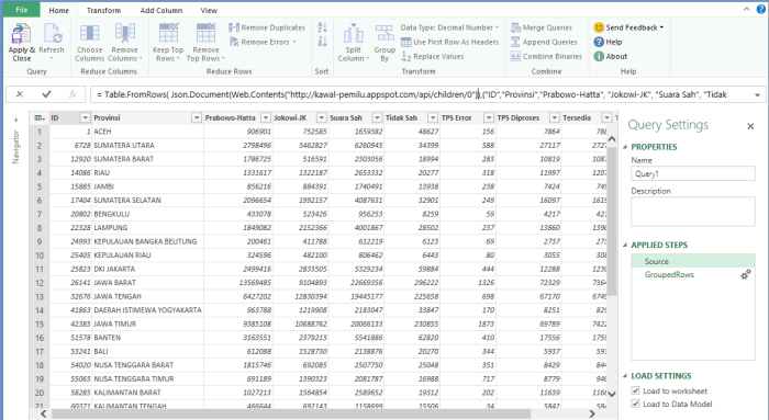
To start with this analysis, I did a bit of inspection on http://kawalpemilu.org/script to get their data feed and make it the data source in PowerQuery.
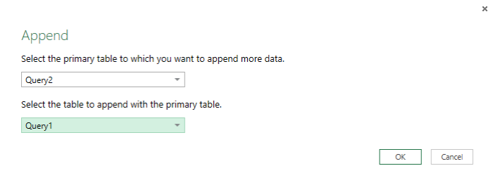
To achieve the comparison between the two candidates, I need to create 2 separate queries for each candidates and combine the query using append functionality.
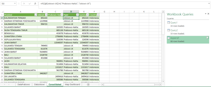
That resulting the consolidated query with the comparison of the total votes for each candidates. With a simple excel formula, I create Type column to be used in PowerView map as key of the candidates.
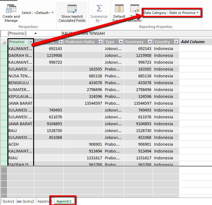
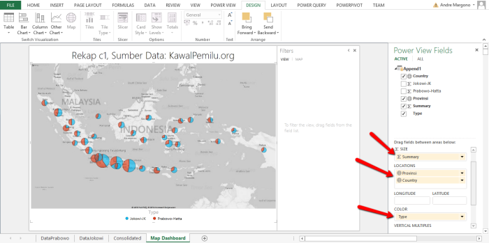
Now I have the required data to generate the PowerView distribution map. However before the data becomes usable for Map control in PowerView, I need to change the Province and Country column behaviour as geographic data using PowerPivot.
Now the data is ready to be used in Map control in PowerView. To create the PowerView, navigate to Insert > Reports > PowerView in Excel ribbon bar.
With minor configuration the geographical distribution is displayed on PowerView Map.
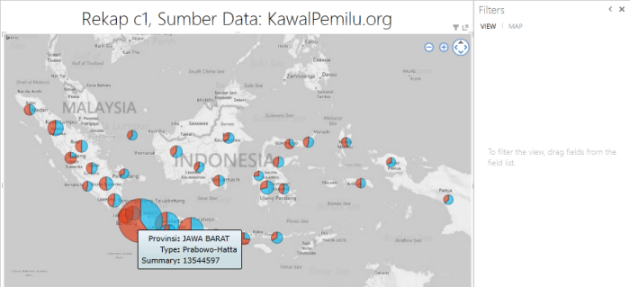
With the detail of distribution of the votes on each candidates based on the geographical location:
The source Excel file is available here: KawalSuaraDashboard
I pray that the final outcome can be announced without any commotion next week.
Conclusion
PowerBI with Excel is really useful to generate geographical representation of the data. Obviously this is really useful in CRM world to get customers, competitors and partners data visualisation.

